A Climate in Crisis
Explore the data, read the reports, and be part of the solution.
Crafted with ❤️ by Jovi
Understand the Data
Key Charts Explained
- Carbon Dioxide Levels: Shows how CO₂ concentrations have changed over time, correlating with higher global temperatures.
- Methane Levels: Tracks concentration trends of this powerful greenhouse gas.
- Global Temperature Anomalies: Indicates temperature deviations from historical baseline.
- World Ocean Warming: Shows how oceans are heating up, affecting weather patterns and marine life.
AI-Generated Summaries
We provide AI-generated summaries of recent news articles related to climate change. This feature highlights major events, scientific discoveries, and public sentiment around environmental topics.
Tips for Reading the Data
- Look for trends over time rather than focusing on day-to-day changes.
- Compare different charts to see how one might influence the other.
- Check the source of each chart for detailed methodologies.
UNFCCC Conference of the Parties (COP)
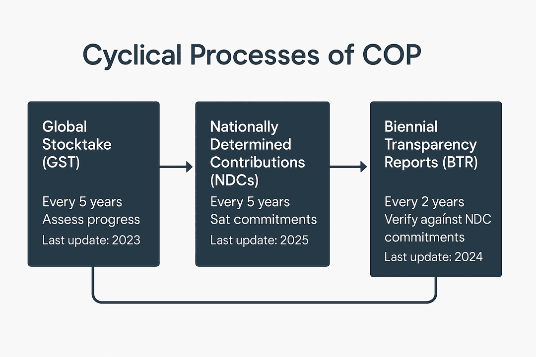
The COP implements key processes to keep global climate efforts on track. The Global Stocktake (GST) occurs every 5 years to assess collective progress. Countries update their Nationally Determined Contributions (NDCs) to strengthen climate commitments and submit Biennial Transparency Reports (BTRs) to verify their progress.
Climate Data Charts
Loading CO₂ graph...
Loading Methane graph...
Loading Temperature graph...
Loading Ocean warming graph...
News Analysis
Climate Imagery
No images available
Ready to Take Climate Action?
Explore our tools for analyzing climate data, understanding policy reports, and contributing to global solutions.